Android Icon Templates: A Complete Guide to Creating Stunning App Icons
Introduction to Android Icon Templates
In the world of mobile app development, one critical aspect that often defines the user experience is the icon design. Android icons are more than just visual symbols; they represent the identity of your app and are often the first thing users notice. Whether browsing the Google Play Store or navigating through their home screen, a well-designed Android icon can significantly impact a user's decision to download or engage with your app.
For developers and designers, the key to creating a high-quality, professional-looking app icon lies in utilizing Android icon templates. These templates ensure that your icon meets Google's design guidelines while providing the flexibility to customize your icon to fit your brand's unique aesthetic.
In this article, we will dive deep into the essential aspects of Android icon templates, offering a comprehensive guide on how to create visually appealing and high-performing icons for your app. From best practices to technical requirements, we will cover everything you need to know to make your icon stand out.
Why Are Android Icon Templates Important?
Android icon templates serve as a framework that ensures consistency across various devices, screen sizes, and resolutions. Without a proper template, your icon might appear distorted or pixelated on different screens, which can harm the overall user experience. Here’s why they are crucial:
Types of Android Icons
Before diving into the process of designing Android icons, it's essential to understand the different types of icons required by Android apps. Each serves a distinct purpose and has its own design requirements.
1. Launcher Icons: Launcher icons are the most recognizable app icons because they are displayed on the home screen and app drawer. They are the "face" of your app, representing it to users before they even open it.
2. Notification Icons: Notification icons appear in the status bar when your app generates a notification. These icons are typically monochromatic and need to be simple enough to convey information at a small size.
3. Shortcut Icons: These are similar to launcher icons but are used for shortcuts that can be created on the home screen. Shortcut icons have the same size and requirements as launcher icons but often reflect a specific action within your app.
4. App Widget Icons: App widgets often use icons to represent quick access to the app’s content. These icons may follow the same design rules as launcher icons but must work well within the widget design. High Quality Free and Premium Vector Icons
Best Practices for Designing Android Icons
To design a successful Android icon, you must balance creativity with the functional and technical aspects of Android's design guidelines. Here are some best practices to ensure that your icon is both visually appealing and meets Android's requirements.
1. Follow Material Design Guidelines: Google's Material Design guidelines provide an excellent starting point for creating Android icons. These guidelines emphasize simplicity, bold colors, and clean shapes, which ensure that your icon looks great across various devices.
2. Utilize Adaptive Icon Layers: Adaptive icons consist of two layers: a foreground and a background. This allows your app icon to adjust to different shapes without losing its visual identity. When designing adaptive icons, make sure both layers are properly aligned.
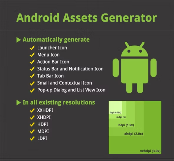
3. Optimize for Multiple Screen Densities: Android devices have a wide range of screen densities, from ldpi (low density) to xxxhdpi (extra-extra-extra high density). To ensure your icon looks good on all devices, you need to create different versions of your icon optimized for each density.
4. Keep Scalability in Mind: When designing icons, think about how your design will scale. Your icon must maintain clarity and recognizability at various sizes, from the small notification icon to the large Play Store graphic.
5. Test Your Icon Across Different Backgrounds: Icons will appear on different backgrounds, from light to dark, and from simple to complex wallpapers. Always test your icon in various contexts to ensure it remains legible and visually appealing. Abstract Icon Templates
How to Use Android Icon Templates
Using a well-structured Android icon template makes the design process smoother and ensures that your icon is perfectly aligned with Google's specifications. Follow these steps to create your Android icon using a template.
1. Download the Right Template: Many websites and design tools offer free Android icon templates that include the necessary layers and sizes. Make sure to choose a template that supports adaptive icons and includes layers for foreground and background elements.
2. Customize the Template: Once you’ve selected a template, start by customizing it to reflect your app’s branding. Use the foreground layer to incorporate your brand’s logo or a unique visual element, while the background layer can provide depth or a solid color.
3. Export the Icon in Multiple Sizes: After completing your design, export the icon in all the required sizes. Most design software, such as Adobe Illustrator or Sketch, allows you to export the file in different resolutions easily.
4. Test the Icon: Before submitting your app to the Play Store, make sure to test your icon across various devices and screen densities. You can use emulators or physical devices to see how the icon performs in different environments.
Tools for Designing Android Icons
There are several tools available to help you create professional Android icons:
Conclusion
Creating a high-quality Android icon is an essential part of app development. By using Android icon templates, following best design practices, and testing your icon across multiple devices, you can ensure that your app stands out visually and meets all the necessary technical requirements. A well-designed app icon can significantly improve user engagement and drive more downloads.
